- Posted On: 7 Feb 2017
- Posted By: Crescentek
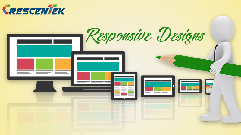
Why You Need A Responsive Website?
- Home
- Post
Looking for a web design that supports smartphones, tablets, good old desktops or any other device/devises? Look no more; Crescentek Responsive web design provides the answer. It is suitable for every device and every screen, regardless of whether it is large or small, mobile or desktop. Responsive web design is focused around providing an instinctive and much rewarding user experience for all. Needless to say, desktop computer, laptop as well as cell phone users all benefit from responsive websites because of their versatile appeal and effectiveness.
As of now, the most popular practice lies within responsive web design that dynamically adopts itself to different browsers and viewports, changing layout and content all the way. What’s more, it has the benefits of becoming all three – responsive, adaptive and mobile. And this is precisely why Crescentek web developers specialize in responsive web design techniques, providing a wide array of responsive website designs for every type of client.
What caused the development of Responsive Web Design?
Escalating use of the internet and web applications on smartphones and other mobile devices has, no doubt been the driving force behind the development of responsive web design, while in reality it means one site can be implemented across various devices.
May sound complex, but easy to maintain due to its flexibility
Responsive web site is pretty easy to maintain as it takes a few minutes to update anything on sites through any content management system (CMS), while the layout changes, depending on the dimensions and competence of the devise.
Increases visibility in search engines
While Google being your demy God you are trying to impress with your website, Content being vital for SEO, quality content regularly posted improves your search engine ranking page positioning and eventually increases your probability of higher search engine ranking.
Increases sales and conversion rate
Yet another benefit of responsive design stems from the truth that the user is provided with improved site experience since there is no requirement for redirection, while the use of Cascading Style Sheets (CSS) across devices and unified design approach create a consistent look and feel.
Decreases Bounce Rate
When you have a responsive website, the user invariably stays longer not only because it offers better navigation, but also lots of animation to keep the person riveted to it. Also rich in UX, it soon turns a visitor into a buyer where the bounce rate is fewer and far between.
Postscript:
You need a responsive website not only because of its universal application but also because Google says so. If you ask Google’s Developers and Webmasters, they would also recommend using responsive web design on account of the benefits it can provide you with. What’s more, it will consolidate your site so you do not need a separate mobile URL, giving you a single easy to manage site.
•
Popular Posts


20 Aug 2015
Mark of a Good App Development Company

12 Sept 2014
W3C Validation and Allied Issues
12 Sept 2014
How Google Treats 404 and 410 Status Codes
12 Sept 2014
Can you compete with Google?
12 Sept 2014